Mobile-first indexing: what a business website needs on mobile for Google to understand it
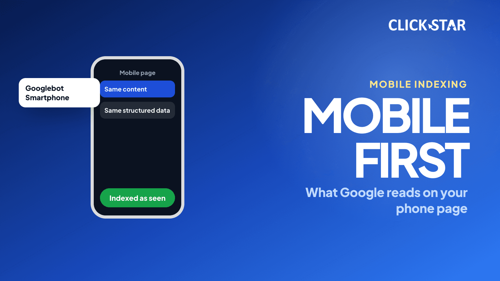
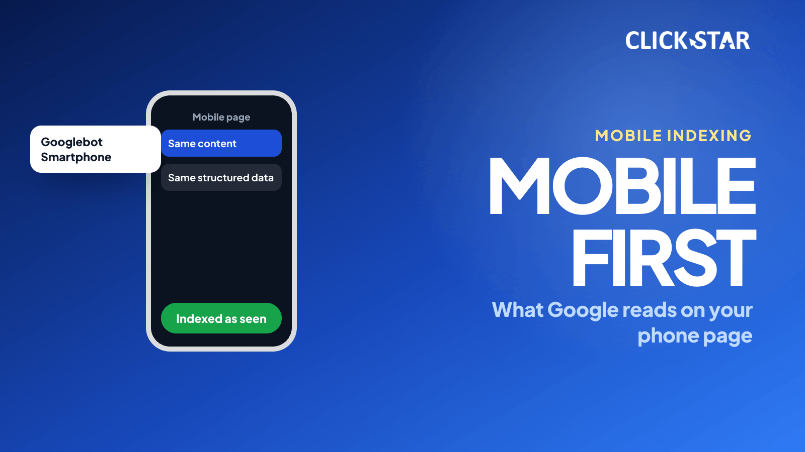
Google indexes and ranks websites using the mobile version. This article draws on Google Search Central, web.dev, MDN and the Web Almanac 2025 for content parity, structured data, the viewport and checks in Search Console.
Owners may mostly browse their website on a computer, but Google mainly reads it through the mobile version. If that version lacks content or has blocked resources, the missing part may not enter the index even when the desktop version is complete.
This article explains mobile-first indexing, what Google needs from the mobile version, 3 ways to serve mobile pages, the viewport tag, checks in Search Console and a 14-day plan. Sources: Google Search Central, web.dev, MDN, Chrome for Developers and the Web Almanac 2025, checked on October 23, 2026.
Click Star already has articles on Googlebot, Core Web Vitals, INP, WCAG and robots.txt. This one asks a single question: is the mobile version enough for Google to understand the page. Click Star sells SEO-ready, fast-loading website design, so it has an interest.
Key points
- According to Google Search Central (updated December 10, 2025), Google uses the mobile version of content, crawled with a smartphone crawler, for indexing and ranking. A mobile version is not required but is very strongly recommended.
- On October 31, 2023, Google announced the move to mobile-first was complete, except for a very small set of sites that do not work on mobile.
- The mobile version needs the same main content, titles, descriptions, robots tags, structured data and image alt text as the desktop version. Tabs or accordions are allowed if the content stays equivalent.
- Google recommends responsive as the easiest to implement and maintain. Per the Web Almanac 2025, the viewport tag is on 95.2% of mobile pages, while Vary: User-Agent is on under 1% of pages.
- The viewport tag should be width=device-width, initial-scale=1, and should not disable users' zoom.
- To check: URL Inspection, the Page indexing report and Crawl Stats. The Mobile-Friendly Test and the Mobile Usability report have been retired since December 1, 2023.
What mobile-first indexing is and whether it is finished
Mobile-first indexing means Google uses the mobile version of a page for indexing and ranking. Per the Google Search Central blog of October 31, 2023, Google began focusing on mobile with the 2015 mobile-friendly update, started mobile-first crawling and indexing in 2016, and announced completion on that date.
The same post says a very small set of websites do not work on mobile: they show errors to all mobile users, block the mobile version with robots.txt while allowing desktop, or redirect every mobile page to the homepage. Google still crawls them with the legacy desktop crawler and re-evaluates a few times a year.
The Googlebot page (updated February 3, 2026) describes 2 types: Smartphone simulates a mobile user, Desktop a desktop user. For most sites, most crawl requests come from the mobile crawler.
Why the mobile version decides the outcome
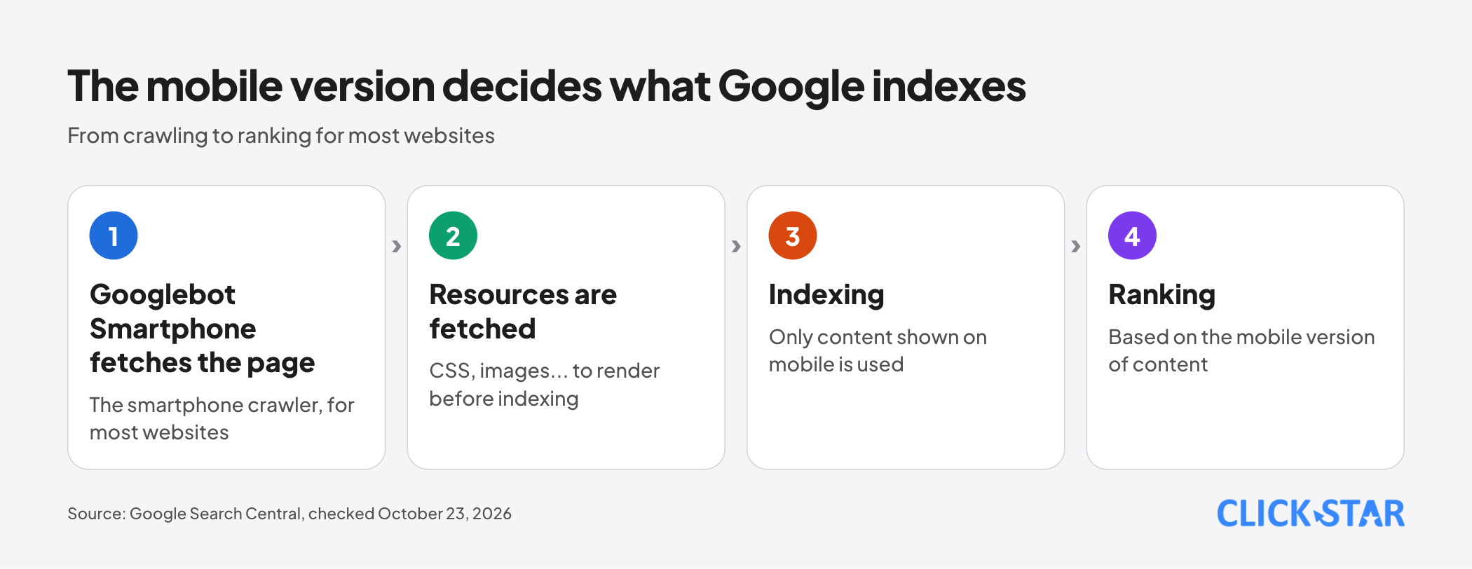
The mechanism is a chain: the smartphone crawler fetches the page and resources such as CSS and images, then indexes the content shown on the mobile version. Per the Crawl Stats help page, resources are fetched to render the page first.
First consequence: content only on the desktop version does not enter the index, because the documentation states that only content shown on the mobile version is used for indexing. If you intend the mobile page to have less content, Google says to expect some traffic loss.
Second: the 2 Googlebot types share a robots.txt token, so you cannot block just one. Third: per the lazy-loading documentation, Google Search does not scroll or click, so content shown only after a user action may go unseen.
Content and structured data that must be on the mobile version
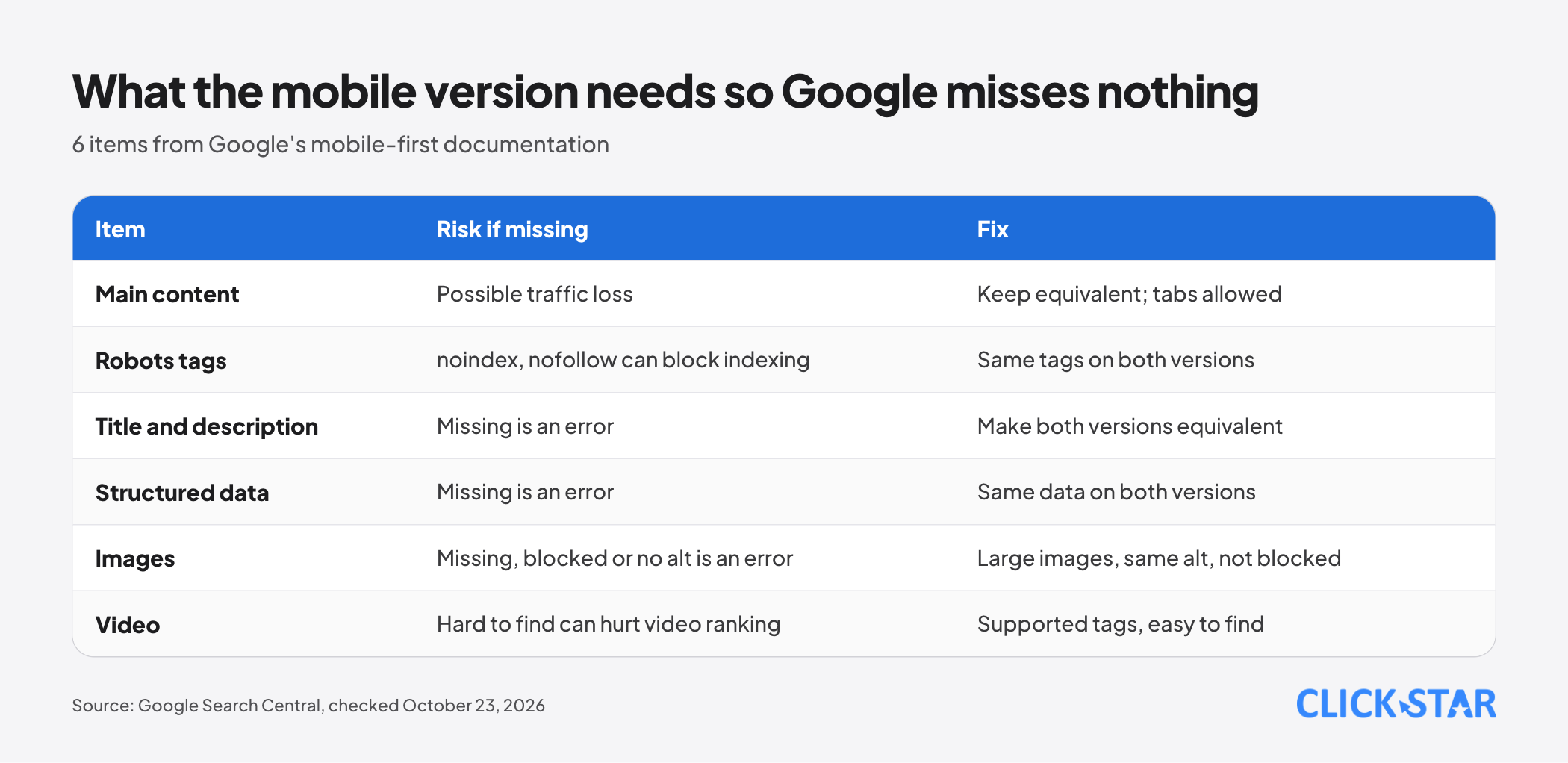
Per Google's documentation, the main content must be equivalent. The layout may differ, for example with accordions or tabs, if the content stays equivalent and the headings match the desktop version.
Robots tags. Use the same robots meta tags on both versions. With noindex or nofollow on mobile, Google may fail to crawl and index the page once the site is enabled for mobile-first.
Titles and descriptions. The title element and meta description must be equivalent on both versions; a missing element on mobile is listed as an error.
Structured data. Both versions need the same structured data. If you must prioritize, Google suggests Breadcrumb, Product and VideoObject first.
Images. Use high-quality images, not too small, and no URLs that change on every page load. Alt text, captions and filenames should match the desktop version.
Video. Use a supported format in video, embed or object tags, avoid constantly changing URLs, and place the video where it is easy to find on mobile.
3 ways to serve mobile pages
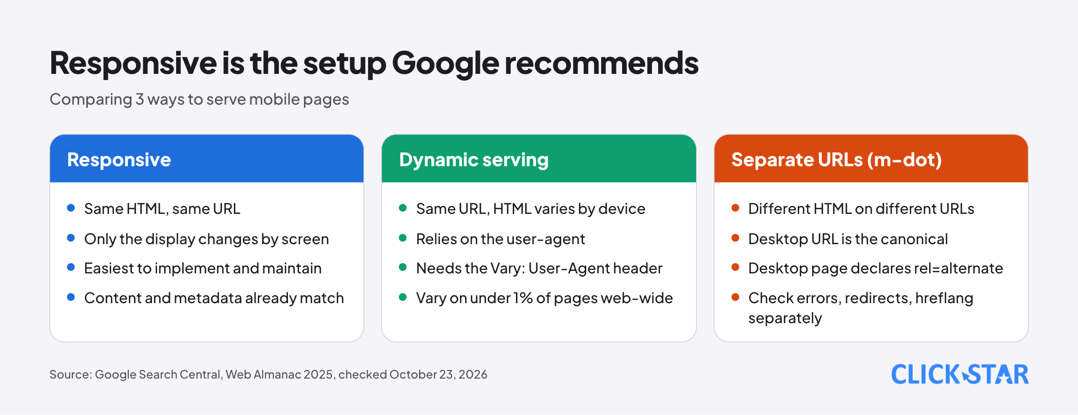
Google lists 3 configurations. Responsive serves the same HTML on the same URL and only changes the display by screen size. Google recommends it as the easiest to implement and maintain; content and metadata are then already the same on both versions.
Dynamic serving uses a single URL but serves different HTML by device, relying on the user-agent and the Vary: User-Agent header. Separate URLs (often called m-dot) serve different HTML on different URLs and use the same mechanism to redirect.
The Web Almanac 2025 (updated June 9, 2026) puts Vary: User-Agent on under 1% of pages, a web-wide header frequency, not the share of sites using dynamic serving.
For separate URLs, Google lists extra conditions:
- Error status must match: if mobile returns an error page while desktop is normal, the page drops out of the index.
- Mobile URLs must not contain a # fragment, because URLs with fragments are mostly not indexable.
- Each desktop URL needs an equivalent mobile URL; if many redirect to the mobile homepage, those pages drop out of the index.
- The desktop URL is always the canonical: the mobile page points its canonical to it, and the desktop page uses rel=alternate with a media attribute pointing to mobile.
- Verify both versions in Search Console, check hreflang separately, and make sure the mobile server can handle a higher crawl rate.
The viewport tag, layout and tap targets
Per web.dev (updated February 12, 2019, fairly old), mobile browsers by default render at a desktop width, usually about 980px, then scale down. A meta viewport tag with width=device-width, initial-scale=1 tells the browser to use the real screen width.
MDN (modified September 23, 2026) recommends width=device-width and says initial-scale=1 is usually unnecessary. Chrome's "Optimize viewport for mobile" (October 8, 2025) lists the criteria as width set and initial-scale of at least 1; otherwise taps can lag by up to 300 milliseconds. They disagree, so Click Star advises declaring both.
web.dev discourages maximum-scale and user-scalable because they can block zooming; MDN warns user-scalable=no is hard on people with low vision.
For layout, web.dev advises max-width 100% on images and not hiding content just because it does not fit. For tap targets, WCAG 2.2 criterion 2.5.8 (level AA) requires at least 24 by 24 CSS pixels, with some exceptions.
Blocked resources, lazy loading and overlays
According to the mobile-first documentation, do not block with disallow the resource URLs that the mobile version uses. An important image blocked by robots.txt on the mobile version is listed as an error.
On lazy loading, the "Fix lazy-loaded content" documentation (December 10, 2025) advises loading content when it becomes visible, using built-in browser lazy loading for images and iframes or IntersectionObserver. For infinite scroll, each chunk needs its own stable URL, such as ?page=12, linked sequentially.
On overlays, the documentation on intrusive interstitials (December 10, 2025) says intrusive overlays may frustrate users and make content hard for search engines to understand. Google advises small banners. Click Star already has an article on cookie banners.
How to check with Search Console and browser tools
The old tools are gone: a note on the 2016 Google Search Central blog post about the tool says the Mobile Friendly Test and the Mobile Usability report were retired on December 1, 2023. The page experience page (September 22, 2026) points to Lighthouse for mobile usability.
URL Inspection. Per the help page, the indexed version has a Crawled as field (desktop or mobile), plus the HTML and loaded resources. A screenshot exists only in a Live Test. "URL is on Google" does not guarantee the page appears in results.
Crawl Stats. The report splits crawl requests by Googlebot type, including Smartphone and Desktop. Google says it is for advanced users and sites under 1,000 pages should not usually need it.
Browser. Chrome DevTools device mode (February 20, 2024) is only a first-order approximation; test on a real phone too.
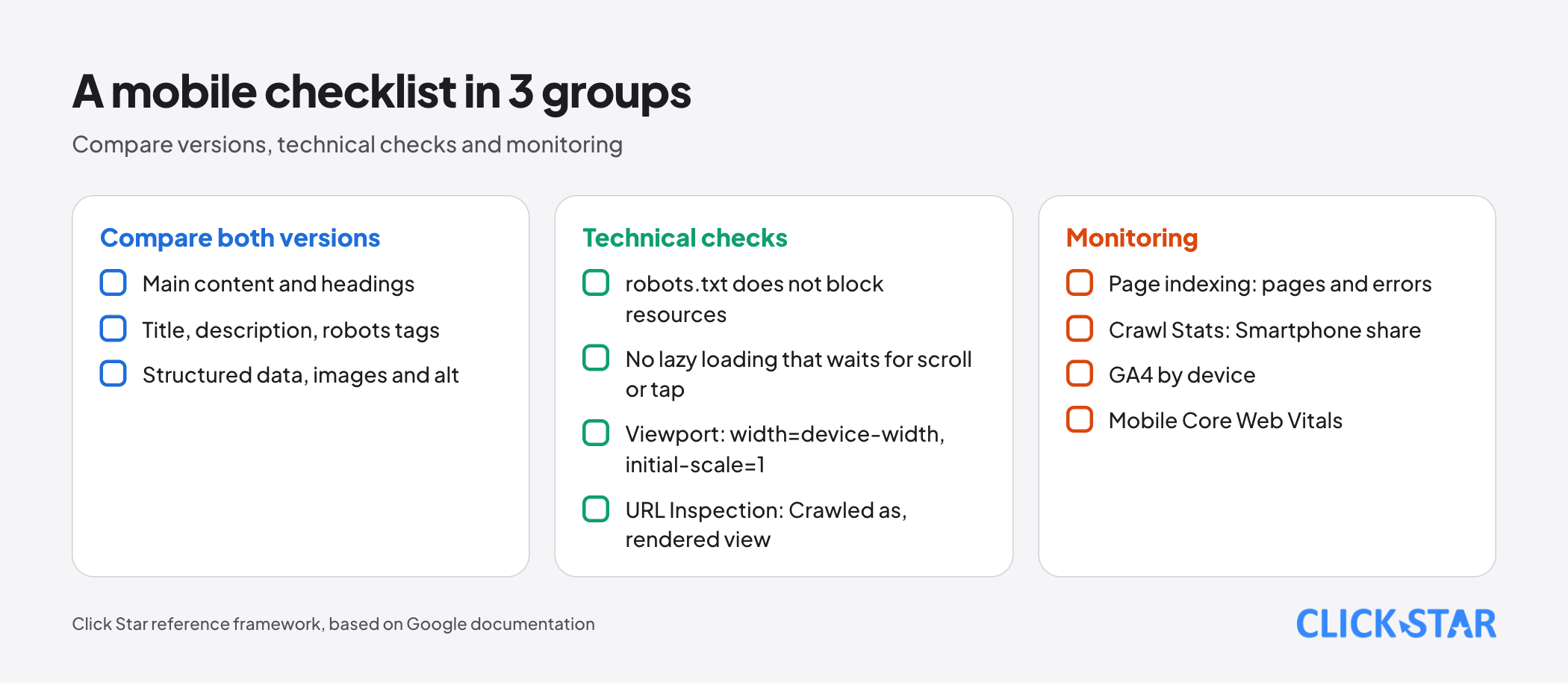
Measuring after the fix. Track Page indexing errors, Smartphone share in Crawl Stats, visits by device in GA4 and the mobile Core Web Vitals pass rate.
What this means for Vietnamese businesses
Click Star found no measurement of the mobile share of visits to Vietnamese business websites; the Statcounter page needs JavaScript and could not be read.
DataReportal (Digital 2026, late-2025 data, secondary source) reports 137 million mobile connections, equal to 134% of the population, and 85.6 million internet users. Some connections carry only voice and SMS, so this does not show what share of website visits come from phones.
Click Star's view. This is a technical judgment, not a measurement. For a new website, responsive is the default because it matches Google's recommendation and avoids keeping 2 versions in sync. Keep dynamic serving or separate URLs only for legacy reasons, and then check every condition above.
Themes or plugins that hide content blocks on mobile can cause errors (Click Star's view, not measured), so compare the rendered page, not just template code. A Lighthouse score does not replace comparing content across versions. For device mix, see the site's own GA4.
A 14-day plan
The plan and the sample page count are a Click Star reference framework, not taken from outside sources.
- Days 1 to 2: identify whether the site uses responsive, dynamic serving or separate URLs, and pick the 5 most important pages as samples.
- Days 3 to 5: compare mobile and desktop on the 5 pages: main content, headings, titles, descriptions, robots tags, structured data, image alt text and video.
- Days 6 to 8: check robots.txt, lazy loading, overlays and the viewport tag.
- Days 9 to 11: run URL Inspection (indexed version and Live Test) on the 5 pages; note Crawled as, the rendered view and blocked resources.
- Days 12 to 14: fix issues, re-run the checks, then monitor Page indexing, GA4 by device and mobile Core Web Vitals.
What is not known
Google does not publish a list of websites still crawled with the desktop crawler. The 2023 post says it re-evaluates a few times a year; Click Star found no newer announcement.
There is no measurement of traffic lost when the mobile version lacks content: Google only says it can happen. The documentation does not say how content hidden with CSS display none is handled.
There is no Vietnam-specific measurement of the mobile share of visits or of sites still using separate URLs. The URL Inspection and Crawl Stats pages show no update date. Click Star has not tested the 300-millisecond tap delay on current Chrome.
Common mistakes
- Checking only the desktop version and concluding the website is fine.
- Deleting content on mobile instead of moving it into tabs or accordions.
- Letting robots tags differ between the 2 versions, especially noindex or nofollow present only on mobile.
- Blocking the mobile version's CSS, JavaScript or images in robots.txt.
- Lazy loading main content only when the user scrolls or taps.
- Disabling zoom with user-scalable=no or a low maximum-scale.
- Redirecting every desktop URL to the mobile homepage, or declaring canonicals in the wrong direction between the 2 versions.
Related posts
Need tailored advice for your business?
Click Star helps you build a solution that fits your industry and scale. We answer every question during business hours.