Website image optimization: WebP, AVIF, responsive images, lazy loading and the LCP image
This article explains how to choose JPEG, PNG, WebP, AVIF or SVG, declare dimensions, use srcset, lazy loading and handle the LCP image, based on web.dev, MDN, Google Search Central and Click Star's own measurements on sample images.
Images are usually the heaviest part of a web page and the largest element on the first screen. Just 1 wrong attribute on the hero image can slow LCP or shift the layout.
This article covers choosing a format (JPEG, PNG, WebP, AVIF, SVG), dimensions, responsive images, lazy loading, the LCP image and image SEO. The main sources are web.dev, MDN, Google Search Central, the Next.js documentation and the Web Almanac 2025, checked up to October 22, 2026.
Click Star already has separate articles on website speed and Core Web Vitals, on Next.js versus WordPress and on the pre-launch SEO checklist; this one covers images only. Click Star sells SEO-ready, fast website design, so it has a related interest.
Key points
- According to the Web Almanac 2025, an image is the LCP element on 76.0% of mobile pages and 85.3% of desktop pages.
- WebP and AVIF are usually smaller than JPEG and PNG, but the saving depends on the image. On Click Star's 2 samples, AVIF kept 51% to 57% of the JPEG size and WebP 56% to 98%.
- Every image needs width and height (or aspect-ratio). The Web Almanac 2025 reports that 62% of mobile pages have at least 1 image without dimensions.
- Responsive images need srcset with a correct sizes value; without sizes, the browser assumes the image is 100% of the viewport wide.
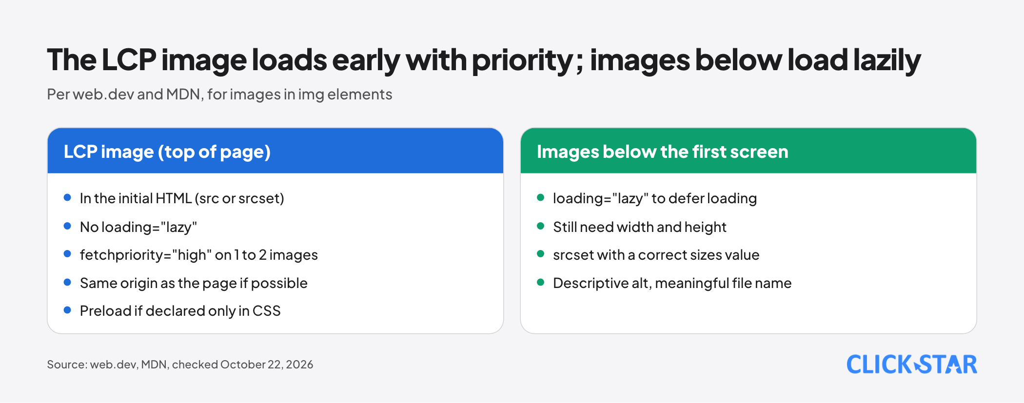
- The LCP image must not use loading="lazy", should be in the initial HTML and should have fetchpriority="high", but for only 1 to 2 images.
- Google does not index CSS background images. A meaningful image must be an img element with a descriptive alt.
- Check with Lighthouse, PageSpeed Insights and DevTools, and look at images by eye before bulk conversion.
How much images affect a web page
According to the Web Almanac 2025 (Page Weight chapter, published January 15, 2026), the median mobile home page weighs 2.56 MB, of which images are 911 KB.
The Performance chapter reports that LCP images are mostly JPG (about 57%), then PNG (26%), WebP (11%) and AVIF (0.7%). This is global data.
web.dev (updated March 31, 2025) warns that image load time is often not the largest LCP bottleneck. Smaller files solve only part of the problem; a late-discovered or lazy-loaded image often costs more.
Which format: JPEG, PNG, WebP, AVIF or SVG
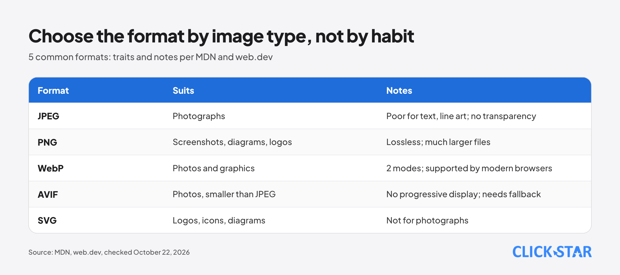
JPEG is lossy and suits photographs; MDN (updated October 8, 2026) notes it is poor for text and line art and has no transparency. PNG is lossless and suits screenshots, diagrams and logos, but web.dev (updated August 13, 2024) says its files are much larger.
WebP has both lossy and lossless modes. MDN says lossy WebP is on average 25 to 35% smaller than JPEG at a visually similar level, lossless WebP is typically about 26% smaller than PNG, and, per web.dev, all modern browsers support it.
AVIF: MDN gives an example of lossy AVIF about 50% smaller than JPEG, but AVIF has no progressive rendering (the file must finish downloading before it shows). Per MDN, support starts at Chrome 85, Edge 121, Firefox 93 and Safari 16.1, and a fallback is advised.
SVG is a vector format that suits logos, icons and diagrams but not photographs (web.dev). Google Search supports WebP, AVIF and SVG (updated March 2, 2026). Click Star's inference: changing format does not get images dropped, but the file URL changes with the new extension, so redirects are needed.
Click Star's measurement: WebP and AVIF on sample images
This is Click Star's own measurement, not an industry figure. Click Star used 2 images from NASA's image library (per NASA's usage guidelines, read October 22, 2026, its content is generally not copyrighted in the United States).
Image 1 is an Artemis I sunrise (ID NHQ202208310005, original 3955 x 3272 px, JPEG) with many smooth areas, and image 2 is the Webb telescope's Cosmic Cliffs (ID carina_nebula, original 2000 x 1158 px, PNG) with fine detail.
Each image was scaled to 1,600 px wide with a Lanczos filter and encoded with Pillow 11.3.0 (libwebp 1.5.0, libavif 1.3.0): JPEG optimize, WebP method 4, AVIF speed 6. Because quality scales are not equivalent, Click Star searched for the lowest WebP and AVIF quality whose SSIM is not below that of JPEG quality 80.
The SSIM is a function written in numpy, computed on luma in non-overlapping 8x8 blocks against the scaled image, so it may differ from other tools.
Image 1: JPEG 139.9 KB, WebP 137.4 KB, AVIF 79.6 KB. Image 2: JPEG 333.5 KB, WebP 187.0 KB, AVIF 171.6 KB.
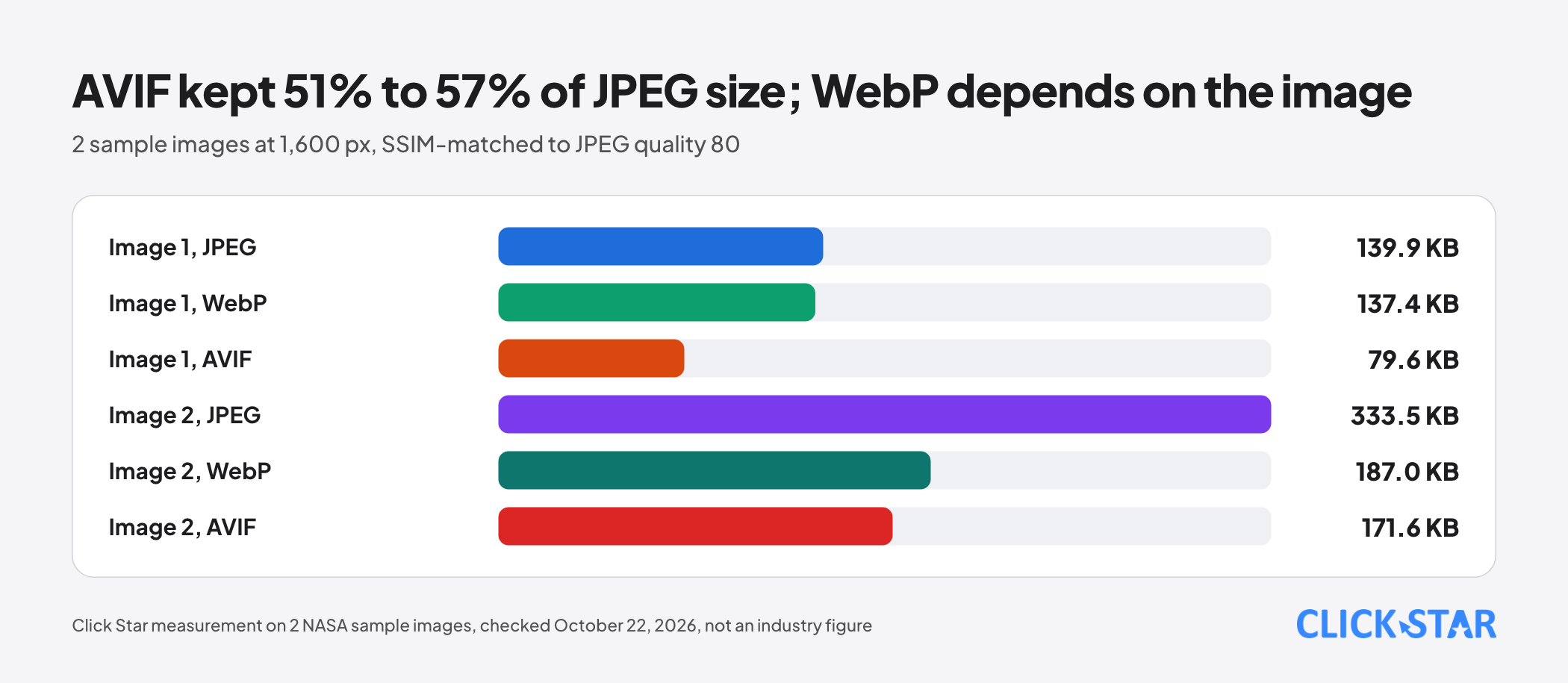
On image 1, WebP is close to JPEG (98%) and AVIF is 57%; on image 2, WebP is 56% and AVIF is 51%. The same format gives very different results by image.
For flat graphics, 1 of Click Star's own infographics at 2,100 x 1,056 px came to PNG 211.2 KB (a PNG re-encoded with Pillow; the original file is 206,766 bytes), lossless WebP method 6 at 88.2 KB (about 42%) and lossless AVIF speed 4 at 62.3 KB (about 30%).
The WebP and AVIF order can flip by image: in another trial on a synthetic flat graphic, lossless WebP was smaller than AVIF. The Next.js documentation says AVIF takes about 50% longer to encode but is about 20% smaller than WebP, and still recommends WebP for most cases.
Declaring dimensions to avoid layout shift
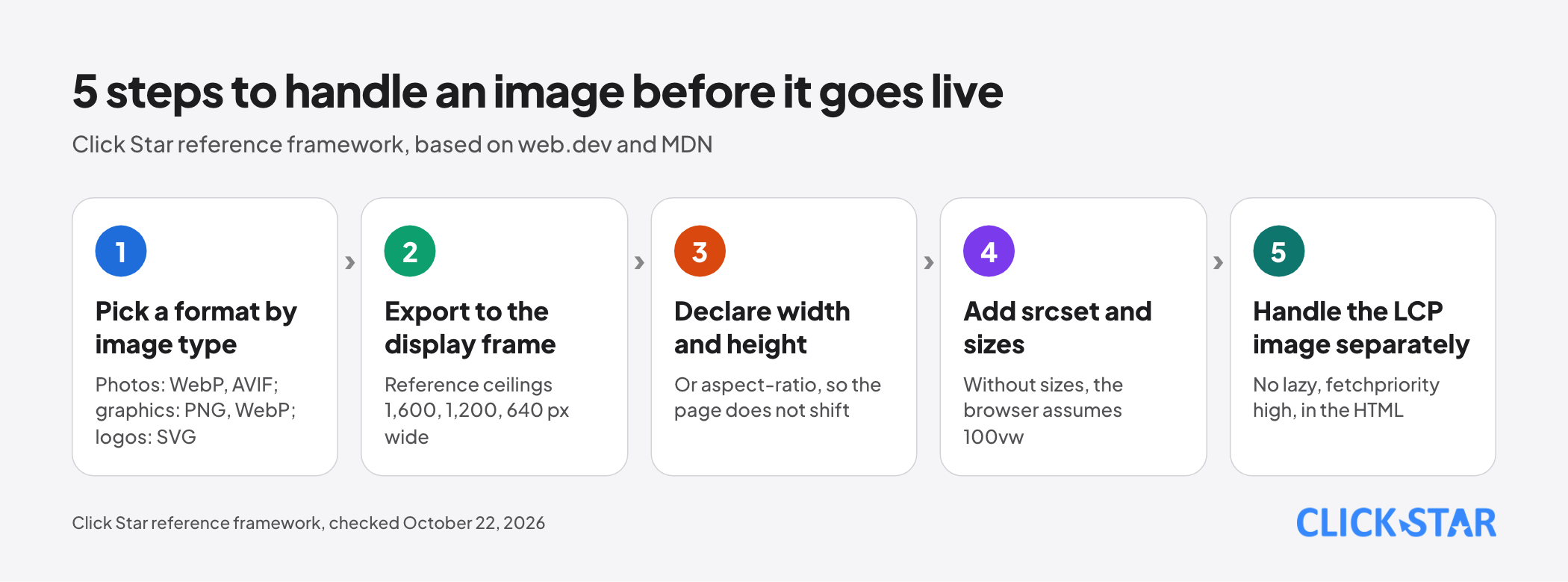
Every image needs width and height. web.dev (updated February 7, 2025) says the browser uses these 2 attributes to compute the aspect ratio and reserve space before the image loads; if they cannot be set, use aspect-ratio in CSS.
Responsive images: srcset, sizes and picture
Responsive images solve 3 problems. Resolution switching uses srcset with sizes. Changing the crop (art direction) uses picture with media. Format switching uses picture with source and type (MDN, pages updated November 6, 2025 and October 1, 2026).
On MDN's img page (updated September 11, 2026), a w descriptor must match the file's real width, w and x must not be mixed in 1 srcset, and without sizes the default is 100vw.
File size grows quickly with width. For image 1, JPEG quality 80 weighs 23.3 KB at 480 px, 51.1 KB at 800 px, 91.8 KB at 1,200 px and 139.9 KB at 1,600 px (Click Star measurement).
Lazy loading: only for images below the first screen
loading="lazy" delays an image until it is near the viewport; the default is eager. Google (updated December 10, 2025) advises not lazy-loading content likely to be visible as soon as the page opens.
web.dev's article "The performance effects of too much lazy loading" (updated March 31, 2022) ran a lab A/B test on WordPress's twentytwentyone theme. Turning lazy loading off cut LCP on archive pages by 13% on desktop and 15% on mobile; lazy-loading only images below the first screen (guessed by an experimental heuristic) cut it by 14% and 18%, with image bytes unchanged.
On single post pages the difference was within the margin of error, and this is not a field measurement. The Web Almanac 2025 reports that about 16% to 17% of pages still lazy-load the LCP image itself.
The LCP image: place in HTML, fetchpriority and preload
web.dev (updated March 31, 2025) gives 3 recommendations for the LCP image: it should be in the initial HTML (an img with src or srcset, not injected by JavaScript or hidden in data-src), it should never be lazy-loaded, and it should have fetchpriority="high".
web.dev (updated November 14, 2023) says that on Chrome images start at Low priority and are raised to High once layout confirms they are in the viewport; since Chrome 117, the first 5 large images start at Medium.
fetchpriority is only a hint, and web.dev says setting high priority on more than 1 to 2 images makes the attribute ineffective. The Web Almanac 2025 reports that 17.3% of mobile pages with an LCP image use fetchpriority="high" on it.
Preload helps when the image is not in the HTML, such as a background declared in CSS: use link rel="preload" as="image" with fetchpriority="high". Keep the LCP image on the page's own origin, because another domain costs an extra connection.
The Next.js documentation (updated September 28, 2026) says that from Next.js 16 the priority prop is deprecated in favor of preload, and that most cases should use loading="eager" or fetchPriority="high".
The decoding attribute (sync, async, auto per MDN) matters less: a post on the personal blog tunetheweb.com (June 2023) concludes that most developers need not worry about it.
CSS background images, alt text and image SEO
Google Search Central (updated March 2, 2026) says Google finds images in the src of an img element (even inside picture) and does not index CSS images. A meaningful image should be an img; CSS backgrounds are for decoration.
Google calls alt the most important image metadata: it should be informative, in context and free of keyword stuffing. File names should be short and descriptive, and images should sit near relevant text.
The Web Almanac 2025 (Accessibility chapter) reports that about 8.5% of alt texts end in .jpg or .png, typically inserted by tools from file names. MDN says an empty alt is for decorative images.
CDNs and automatic formats
According to web.dev (updated August 14, 2019), switching to an image CDN can save 40% to 80% of image file size; that is the claim of an older article, not independently verified.
With next/image, the format is chosen from the Accept header and the default is WebP only.
Exporting images for the content team
This is a Click Star reference framework, not taken from outside sources; replace the widths with the real layout frame.
- Export to the frame, reference ceilings: hero image 1,600 px wide, in-column image 1,200 px, card image 640 px.
- Export photos as WebP or AVIF (with JPEG if the system does not convert automatically); flat graphics as lossless WebP or PNG; logos as SVG.
- Use short, descriptive file names without diacritics; write alt for every meaningful image.
- Mark each page's hero image so developers can add fetchpriority and drop lazy loading.
Click Star's view. A sensible order is usually: fix the LCP image (drop lazy loading, add fetchpriority, keep it in the HTML), declare dimensions, then move to responsive images and format changes. AVIF should come last because it needs visual checks and an encoding cost.
If the LCP element is text, optimizing images will not change LCP; the Web Almanac 2025 reports text is the LCP element on 23.7% of mobile pages. Click Star's website design service page publishes a target of 90 or more PageSpeed points; that is a target, not a measured result.
How to check
Lighthouse 13 (released October 10, 2025, per Chrome for Developers) merges the audits for modern formats, image compression and properly sized images into image-delivery-insight. The audit for a lazy-loaded LCP image is replaced by lcp-discovery-insight, and offscreen-images is removed.
DevTools has an LCP breakdown insight (published October 8, 2025) that splits LCP into 4 parts: server response, load delay, load duration and render delay.
14-day plan (Click Star reference framework)
- Days 1 to 2: pick 5 key pages, find the LCP element on mobile, record the current format and loading.
- Days 3 to 5: fix the LCP image: drop lazy loading, add fetchpriority="high", keep it in the HTML.
- Days 6 to 9: add width and height to every image, add srcset and sizes, switch formats via a CDN or next/image.
- Days 10 to 12: review alt text and file names, move meaningful images from CSS backgrounds to img.
- Days 13 to 14: rerun Lighthouse, compare with the start and update the guide for the content team.
Common mistakes
- Putting loading="lazy" on every image, including the hero image.
- Putting fetchpriority="high" on many images, which makes the attribute ineffective.
- Leaving out width and height, so the page shifts when images finish loading.
- Renaming a file to .webp without converting the real content.
- Declaring a w-type srcset but omitting sizes or giving a wrong sizes frame.
- Using CSS background images for images that matter to the content, so Google does not index them.
- Stuffing keywords into alt or using the file name as alt.
- Converting everything to AVIF without looking by eye or re-measuring on the website's own images.
What is not known
Click Star has not found Vietnam-specific measurements of image formats, lazy-loaded LCP images or images without dimensions, and has not measured AVIF support on older devices. Click Star's measurement covers only 2 photographs, 1 graphic, 1 encoder and 1 metric, and did not run cwebp or avifenc.
Related posts
Need tailored advice for your business?
Click Star helps you build a solution that fits your industry and scale. We answer every question during business hours.